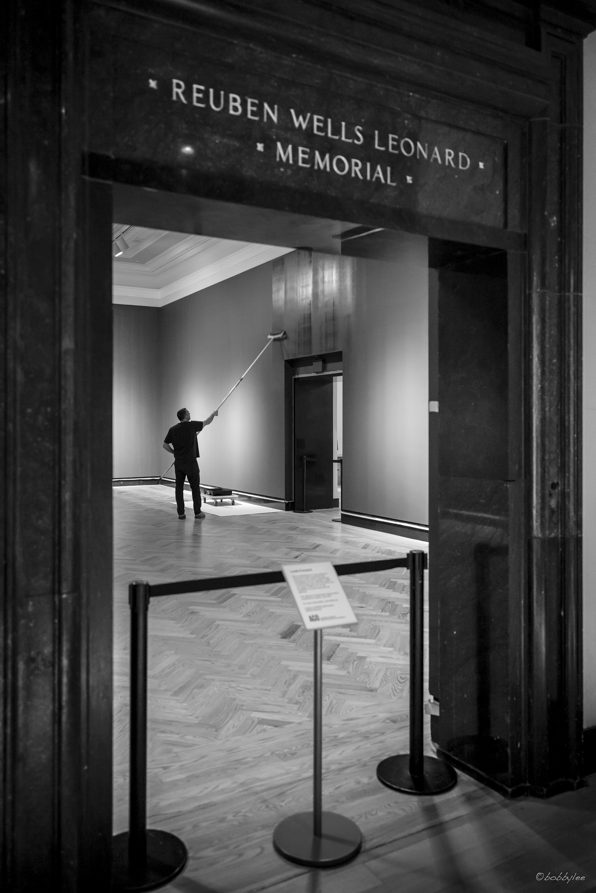
Painter at the Gallery
熟識我拍攝手法的朋友都知道我注重作品中的佈局多於構圖,原因之一是相片內各元素 (無論看似重要與否) 在佈局中會比單靠平衡的構圖更有互動性。與此同時大家可能也知道在安排佈局時我會較為調皮,喜歡在不經意的地方加入一些佈局的元素。其中一種手法是在影像中 (通常是左或右方) 包含一些例如門框或類似的線條 (例子如下圖)。究竟這些看似多餘的部分有什麼作用呢?
For those who familiar with my works may have already noticed I like playing little tricks on the edge of the images. That is, I sometimes leave a tiny space that seems to be meaningless along one side of the image (example below). Many of my travelling photo workshop participants treat this as an invisible signature within my work, but of course there are more than including a space within the frame.
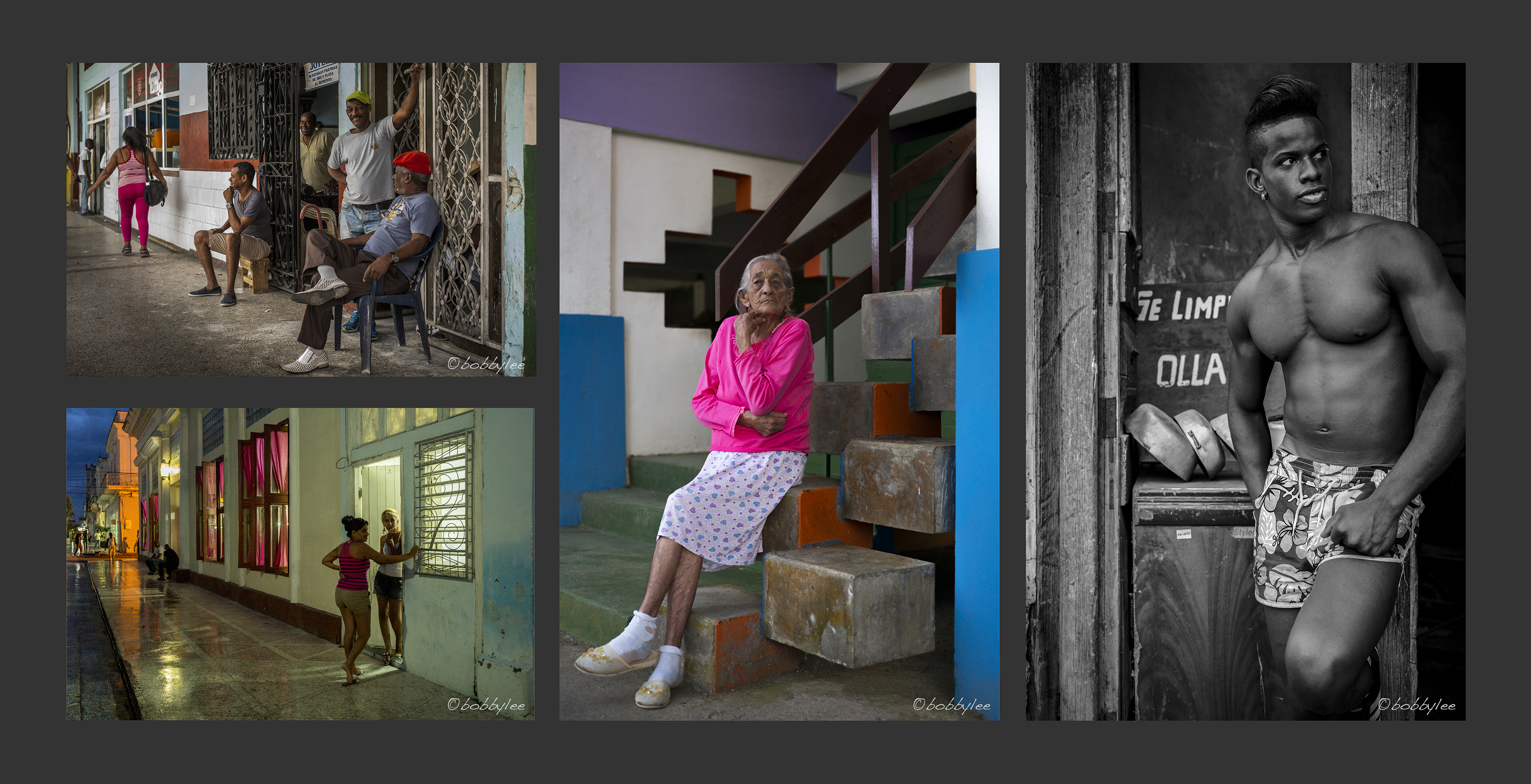
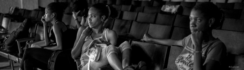
Cuba – Global Exposures Travelling Photo Workshop
在加拿大多倫多的假期拍攝到的其中一張作品 “Painter at the Gallery” 正好是解釋我這種手法的簡易例子。
The image of “Painter at the Gallery (@AGO)” is a very good example to explain a bit more behind the decision of including the seems to be meaningless space. Let’s take a look on the same image, but cropped differently.
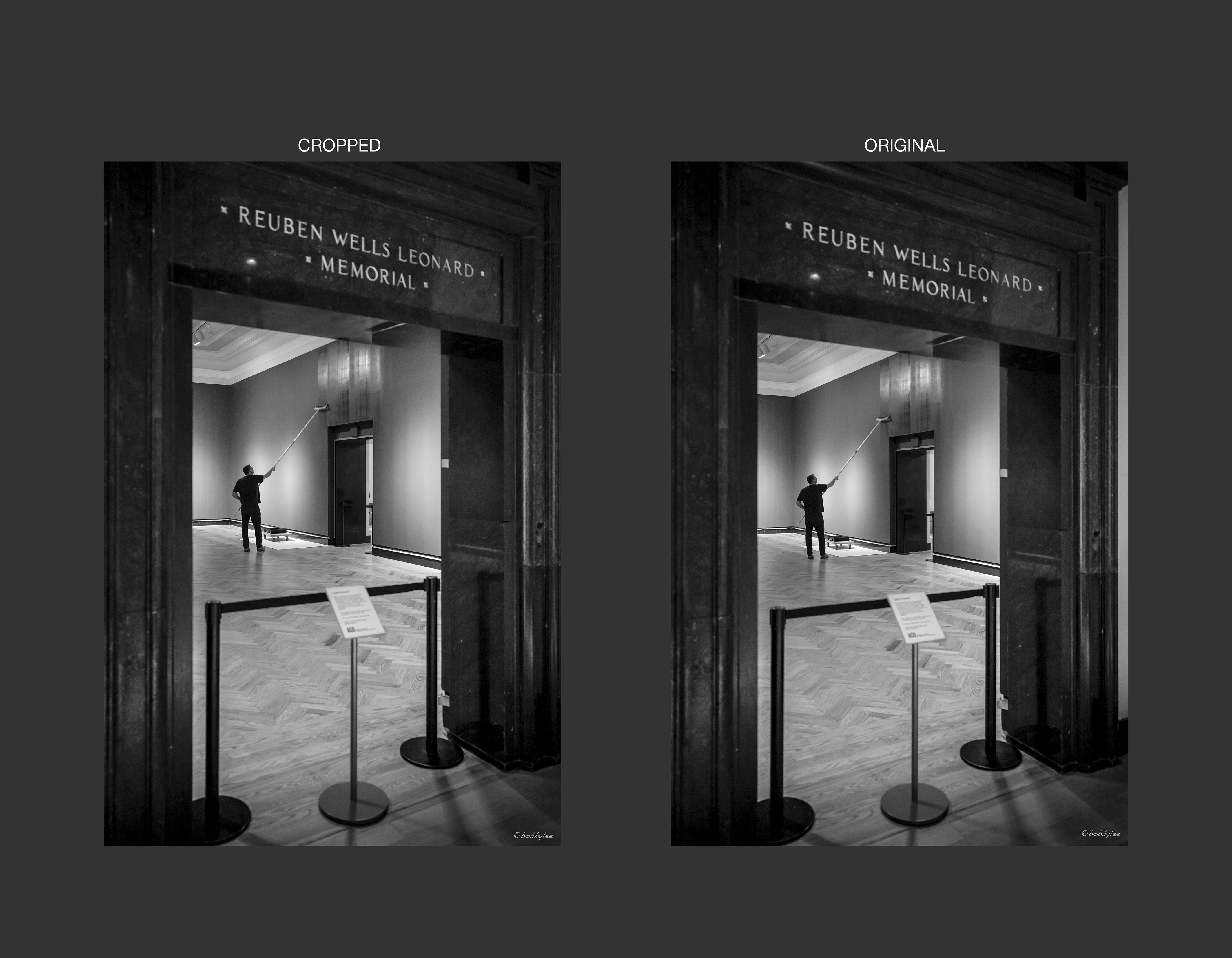
Cropped on the left, Original on the right
在參觀多倫多安省美術館時幸運地遇到工作人員在為未來的展覽場地從新上色。正好像一名畫師為更一些畫家做準備似的感覺。從前我便會跟很多同好一樣用左邊的方法,利用黑色的雲石門框把主角’圍’ 起來突出主題及慨念。這也是學習攝影時較為常用的構圖技巧 (請參考下圖)。
You may find both images look very similar, both emphasizing our AGO painter making ready for the up and coming exhibition (paintings). And as many of you know the dark marble entrance in the foreground act as a frame to encase the main features (our painter at work).
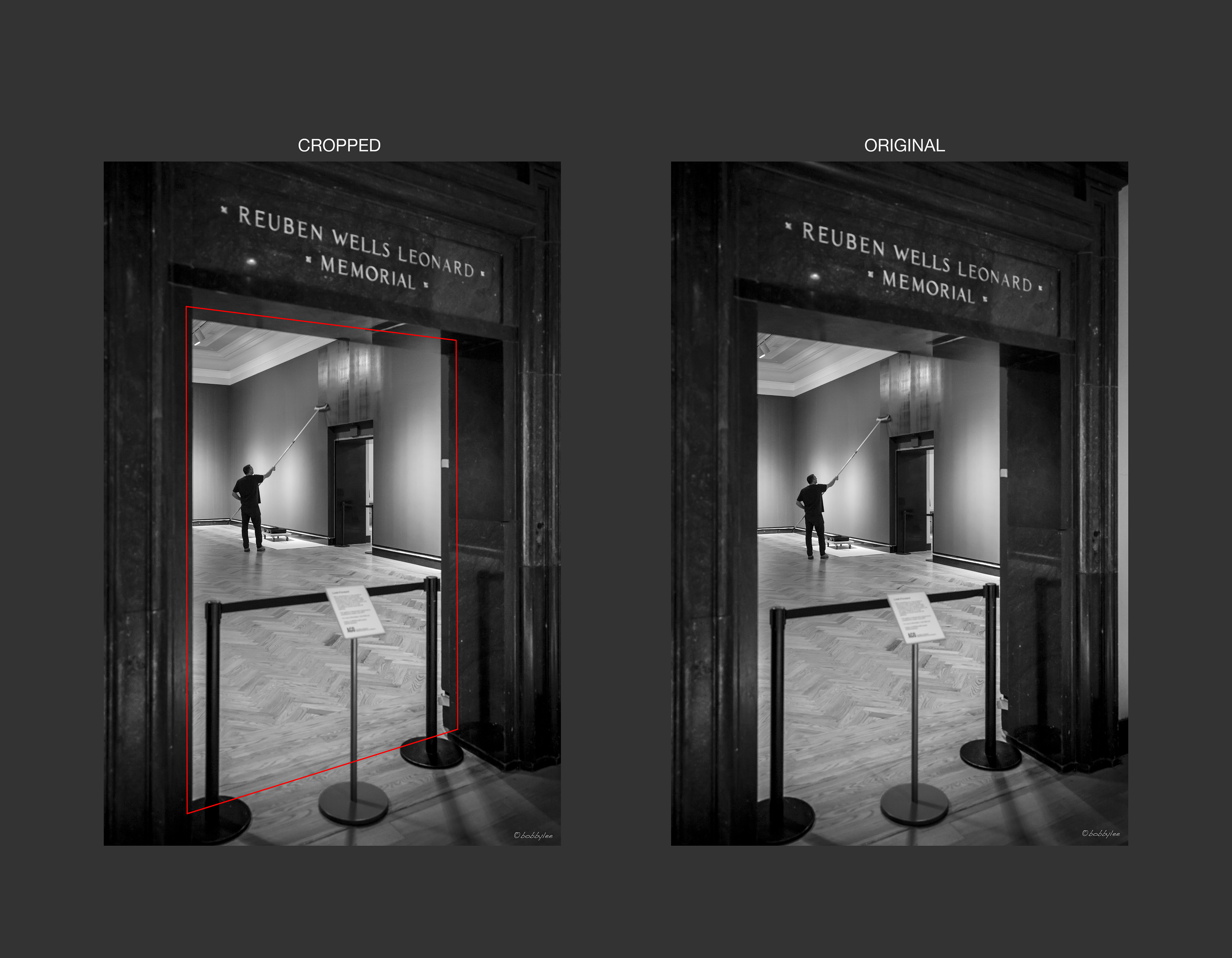
The entrance become the frame for our subject
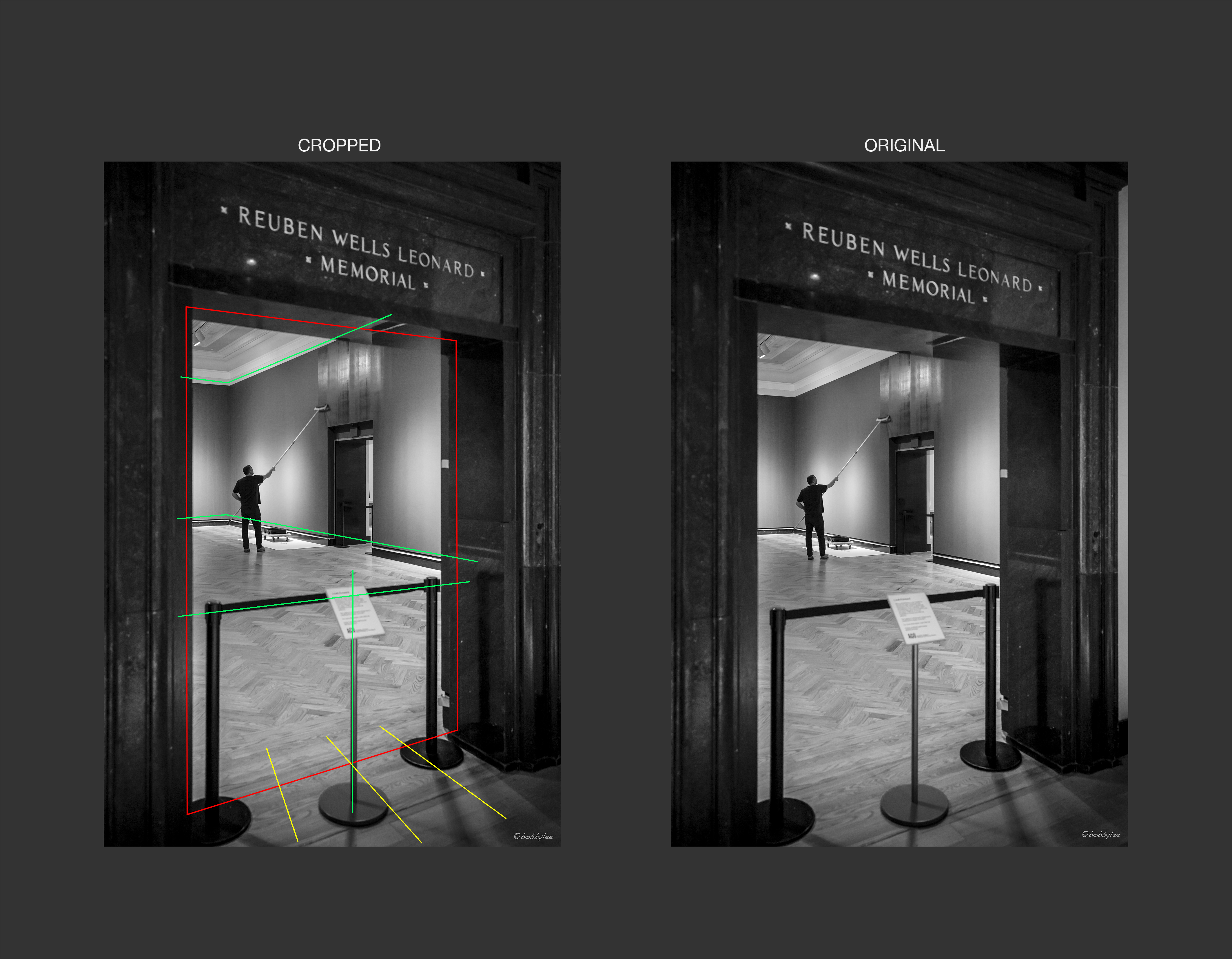
不過由於這景象內所包含的缐條實在太多,所以只會令觀眾的視線越縮越窄。令所有元素被困在這些透視缐條之內。整張相片都不能 ‘呼吸’ 或 ‘擴張’!
But because of the complexity of the lines form by the edges of the wall to the ceiling and the floor, the stand together with the railing in the front. The entrance became less functional in terms of adding depth to the image.

All lines happened inside the entrance
再加上雲石入口地板的光線,用左手邊的取景放法會令作品變得平淡甚至畫面失去平衡。
Also the light spreading out from the entrance on the floor makes the content a bit off balance.
The light spreads on the lower part made the image a bit off balance
解決這個 ‘困’ 局而又不影響相中各元素的方法就是把入口右邊雲石框外的白色牆壁也包括在影像之內。千萬不要小看這小小空間,它可以令室內的空間透視感伸延至雲石開框以外 (甚至跳出影像範圍) ,更可以平衡下方地板上的灰階 (見下圖)!要注意的是千萬不要畫蛇潻足連左邊的白牆也加進影像之內,否則左右互相抵消及破壞整張作品的可觀性。
To perfect the shot, I included a bit of the wall on the right so to emphasise the perspective of the room inside as well as balance out the light on the floor at the entrance. Be careful not to include the white wall on the left or it will cancel out the effect and ruin the simplicity of the image.
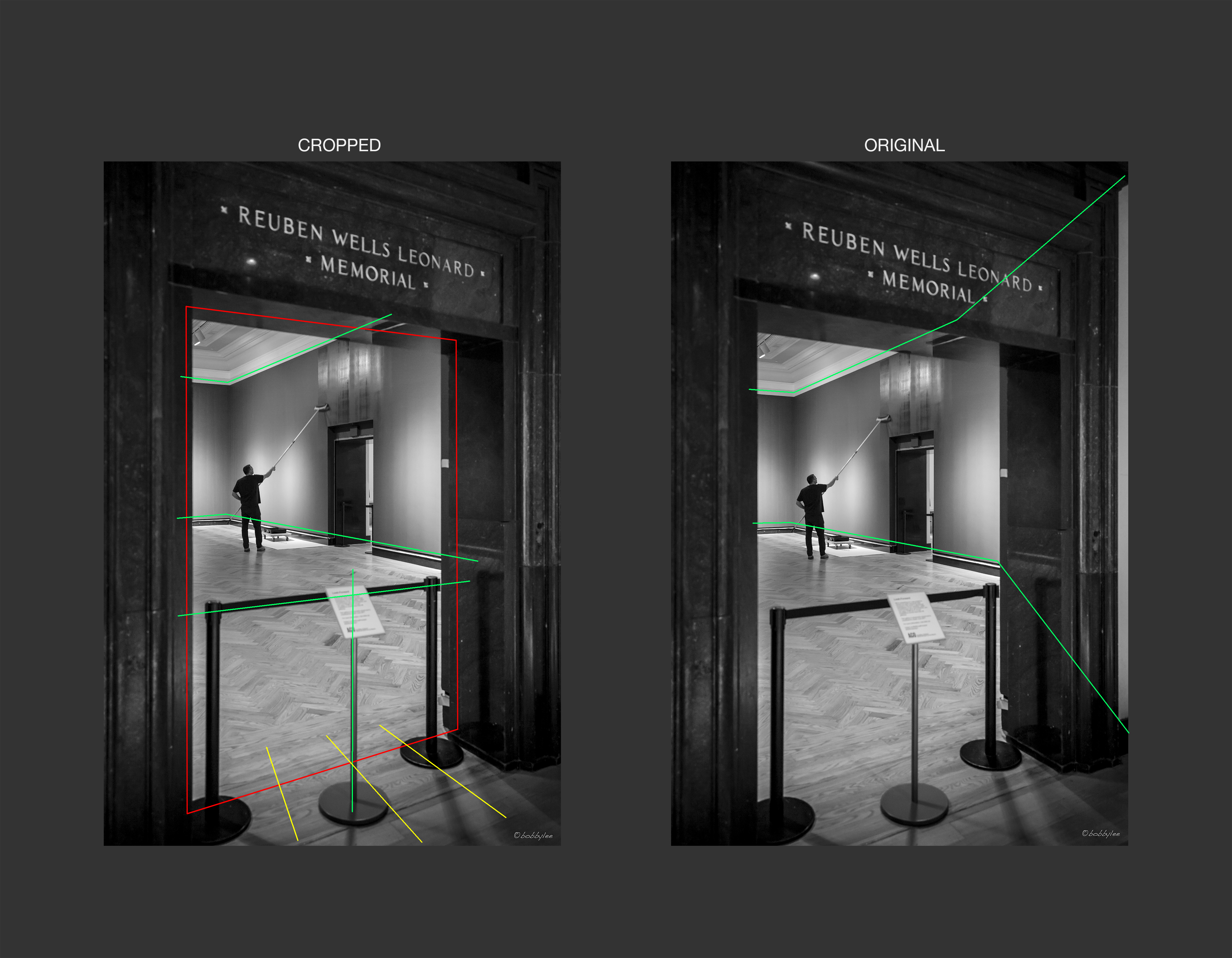
The tiny bit of white wall on the right actually helps to emphasise the size of the room as well as balancing the light on the floor of the entrance
請大家再對比一下這兩張 (見下圖) 只有些微差距的影像,能否看出感觀上的分別?當然我不能說這是唯一的取景方法,每一環境都有千百種演譯及處理的方法。在此只為分享我的經驗。
Now please look again the two images. Which one you prefer? I am not saying my decision must be right to include the bit of white on the right, but for sure the two images look very different with these minor camera position adjustment.
And the entrance’s marble frame looks smaller too
希望大家從這分享得到啟發,學會拆解他人創作背後的心思及培養出自己的表達方式。
I do hope this post not just explaining the way I arrange the content in my photos but also encourage you to explore the thinking pattern of other photographers. Hopefully you can develop your own style of putting together an image.
“Painter at the Gallery (@AGO)”
Global Exposures My Travelling Photo Workshop 不一樣的旅遊攝影工作坊
 (3)Dislikes
 (0)
(0)